
Highlight Negative Values on an Excel Chart
If you work with charts frequently, you may sometimes want any negative numbers to be coloured differently to the rest of the chart
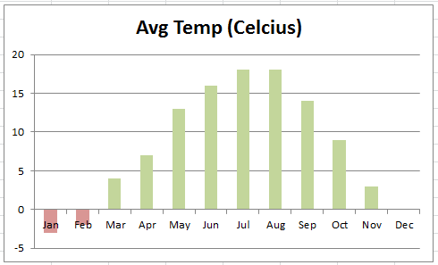
Take this example, showing average temperatures for Prague

We may want to highlight Jan & Feb a different colour to highlight the fact its negative.
Whilst it has always been achievable, in Excel 2010, is a built-in option that it very easy. (2007 & 2003 had to use one of several workarounds)
Right-Click on the data-series, and select ‘Format Data Series’

Select the ‘Fill’ option, and change to ‘Solid Fill’. Change the main colour using the ‘Fill Color’ option, should you wish

Tick the ‘Invert if Negative’ box, and select a colour using the second paint bucket that has appeared.

Click ‘Close’, and that’s it! Your chart should now update!
As I mentioned, this is a feature of Excel 2010. The same effective can be achieved using 2003 & 2007, but is a little trickier – drop a comment if you want me to cover this off!

Leave a Reply