
Creating Waterfall Charts in Excel [2007,2010,2013]
Update: Feb 2016 – If you’re using Excel 2016, be sure to check out the new Waterfall Chart Type, which makes waterfall charts a breeze. Learn more here
Waterfall Charts are another one of those charts that’s much harder to put together than it should be, particularly as they’re a great way to understand the sequential impact of positive & negative values to a total.
That being said, they’re really not as bad as to put together as they’re sometime perceived to be. As with most of the chart techniques I’ve demonstrated, it’s really about tricking excel to show the bits of data you want it to show.
We’re going to go through the process to create the below chart – a simple income & expenditure chart for a shop.
I’m using excel 2013, but the approach is almost identical for previous versions of Excel
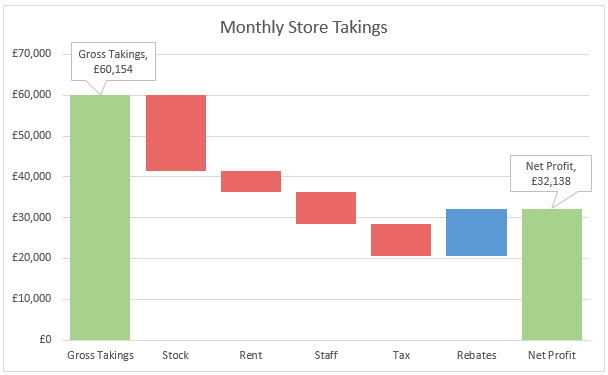
To start, you’ll have some simple data, with a starting value, some positives & negatives, and a finishing total

Because what we’re actually going to do is create a stacked column chart, we need to split the values into ‘Rise’ and ‘Fall’ values, and then the ‘base’ value for each – that is, the lower part of the stacked column on which our waterfall segments will sit.
So for each of your values, move them into either Rise or Fall – with Base being a formula of Previous Base + Previous Rise – Current Fall
The start & end values should only have a ‘Rise’ value
Also, all values should be Positive – if you’re linking your values back to your source data, use the function ABS(Value) to make a negative positive.


We’re ready now to create our chart. Select your new data range, and insert a Stacked Column chart. You should have something similar to this…

Now all we need to do is apply formatting to make it looks like the segments are ‘floating’
Left click ones on one of the blue ‘Base’ value – this should select all the base values as below…

Now change the FILL colour to NO FILL (This will vary by version, but CHARTS TOOLSàFORMATàShape Fill is 2013, and similar for others)


From here, the rest is really down to how you want to format your data. For me, I want RED drops, BLUE increases and GREEN for start/finish values
Select the ‘Fall’ series, ensuring all values get selected, and ‘Fill’ accordingly.

Because our increases and start/end value are part of the same series, we’ll need to first set a base colour for the series, and then colour exceptions individually. Which way round you do this will depend on how many values you have. If you have more than 2 ‘increases’, you’ll probably want to set your blue first, so we’ll do that here as well. Again select the ‘Rise’ series, and fill.

Now select the first value, and then select again, so it becomes the only selected value…

Then colour it in the same way as before, and repeat for the end value

Now we can tidy up the titles and legend (I find a legend isn’t always needed for this type of chart. If you want to keep it, you’ll want to remove the ‘Base’ item. Select it, then select again so only ‘base’ it selected, then DELETE


I also like to add a callout label to the start & end values. Select the first value, twice, so only it is selected.
In 2013, CHART TOOLSàDESIGNàAdd Chart ElementàData LabelsàData Callout


Then drag up to above the column, and repeat for the closing value.
There you have it, a simple waterfall.
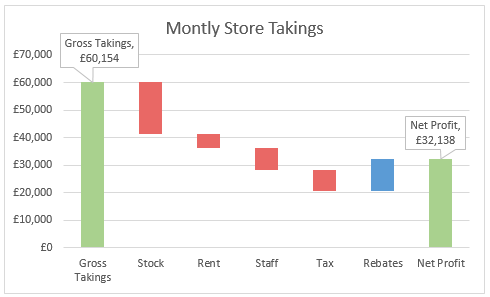
Why not use the pasting shapes technique to add some further direction and clarity to the data?


(ok, I cheated in the last one – the smaller arrows are just manually added lines, and won’t change if your data changes.)

Nice!
Pasting shapes technique into waterfall chart is very interesting. It’s new for me, I didn’t know about such feature. I think, waterfall chart with shapes looks unusual and helps to draw attention of the audience better than regular one.
By the way, you can create waterfall charts with Waterfall Chart Studio add-in to avoid manual operations. And then use the pasting shapes. More details about the add-in you can find by the link http://fincontrollex.com/?page=products&id=1&lang=en